How to Pair Fonts for Web Design (With Examples)
Font pairing is the art of choosing two or three typefaces that work together harmoniously. A strong pairing creates visual hierarchy, sets the right tone, and makes your design feel intentional. A weak pairing creates visual noise and undermines credibility. The rules are simpler than you'd think.
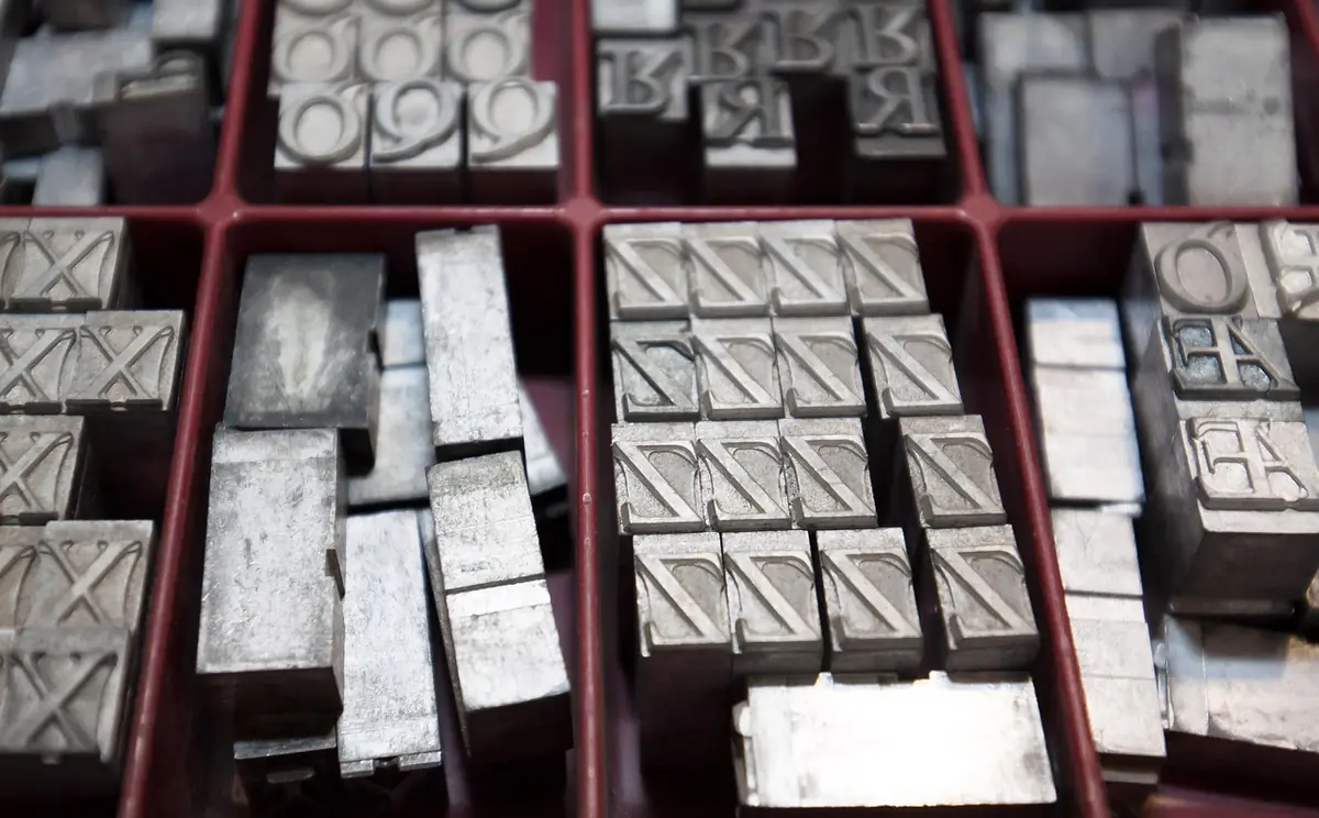
- Find the perfect font pairing for your website.
- The Core Rule: Contrast, Not Conflict.
- Covers heading + body font pairings.
- Covers font pairing rules of thumb.
- Covers building a type scale.
The Core Rule: Contrast, Not Conflict
Good font pairings have clear contrast — they look intentionally different, not accidentally similar. Pair a serif with a sans-serif: the structural differences create natural hierarchy. Pair a display font with a neutral body font: the display font provides personality, the body font provides readability. Avoid pairing two fonts that are similar but not identical — they look like a mistake rather than a choice.
Heading + Body Font Pairings
The most common pattern is a distinctive heading font paired with a clean body font. The heading font carries the brand personality; the body font stays out of the way and lets the content breathe. Proven Google Fonts pairings: Playfair Display (heading) + DM Sans (body) for editorial elegance. Space Grotesk + Inter for tech/SaaS. Bitter + Source Sans 3 for warm professionalism. Syne + DM Sans for creative/agency. Try these in the Font Pairing tool to see them in context with your own content.
Font Pairing Rules of Thumb
Limit to 2–3 fonts per project — more creates visual chaos. Use the same font family for body text and UI labels (buttons, navigation) — switching fonts for small text is disorienting. Pair fonts with similar x-heights so they feel balanced at the same size. If both fonts come from Google Fonts, they'll have compatible loading characteristics. Weight contrast is as important as style contrast — a bold 700 heading with a regular 400 body creates natural hierarchy even within the same family.
background-size animation or @property registered custom properties instead.Building a Type Scale
Once you've chosen your fonts, define a type scale — a set of font sizes that follow a mathematical ratio. Common ratios: Minor Third (1.2), Major Third (1.25), Perfect Fourth (1.333). With a 16px base and a 1.25 ratio, your scale is: 16, 20, 25, 31, 39, 49px. Use the Typography Scale tool to generate a complete scale with CSS custom properties. A consistent scale prevents the 'random font sizes everywhere' problem that plagues many sites.