How to Generate a Color Palette from Scratch
A strong color palette is the foundation of every visual design. Whether you're building a website, branding a product, or designing a dashboard, the colors you choose communicate mood, hierarchy, and professionalism. This guide covers the color theory behind great palettes and how to generate them efficiently.
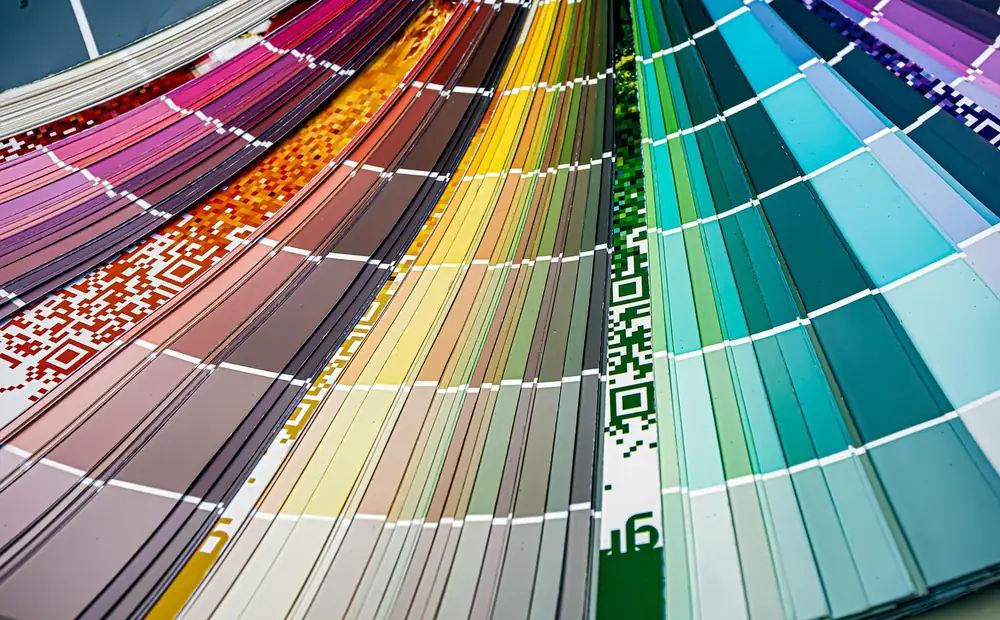
- Build cohesive color palettes using color theory.
- Covers color theory basics.
- Covers harmony rules.
- Covers building a 5-color palette.
- Covers testing your palette.
Color Theory Basics
Color theory provides systematic rules for combining colors. The color wheel arranges hues in a circle based on their wavelength relationships. Primary colors (red, yellow, blue in traditional theory; red, green, blue in digital) combine to create secondary and tertiary colors. Understanding these relationships lets you create palettes that feel balanced and intentional rather than random.
Harmony Rules
Complementary — two colors directly opposite on the wheel (blue + orange). High contrast, energetic, great for CTAs against a neutral base.
Analogous — three colors next to each other (blue, blue-green, green). Harmonious and calming, ideal for nature brands and backgrounds.
Triadic — three colors equally spaced (red, yellow, blue). Vibrant and balanced, common in children's brands and playful interfaces.
Split-complementary — one base color plus the two colors adjacent to its complement. Provides contrast without the intensity of pure complementary schemes.
Building a 5-Color Palette
A practical palette needs five roles: primary (brand color, CTAs), secondary (supporting elements), neutral (backgrounds, text), success/positive (green tones), and danger/negative (red tones). Start with your primary color, generate a complementary or split-complementary secondary, choose a desaturated neutral, then add functional colors. The Palette Generator automates this — enter a base color and it produces a complete palette with all roles filled.
background-size animation or @property registered custom properties instead.Testing Your Palette
Check contrast ratios between text and background combinations using the Contrast Checker. Test the palette in context — apply it to a real UI layout, not just color swatches. Simulate color blindness to ensure the palette works for all users. A palette that looks great as swatches can fail in production if the colors don't provide enough contrast or distinction in actual UI components.