Image Optimization for the Web
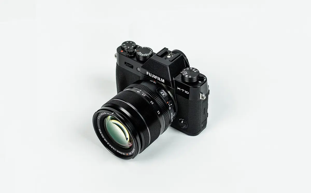
- Compress, resize, crop, and convert images for the web.
- Why Image Optimization Matters.
- Covers image formats in 2026.
- Covers compression types.
- Covers sizing & dimensions.
Why Image Optimization Matters
Images account for ~50% of average page weight. A single unoptimized hero image can add 2-5MB, pushing LCP well beyond Google's 2.5s threshold.
Google uses Core Web Vitals as ranking signals. Pages with unoptimized images rank lower. The performance difference often decides between position 5 and position 15.
Image Formats in 2026
WebP is the default — 25-35% smaller than JPEG with universal browser support. AVIF offers 50% compression but encoding is slower. Use AVIF with WebP fallback via the picture element.
-webkit-backdrop-filter alongside backdrop-filter for Safari support. Without the prefix, the effect is invisible to roughly 25% of mobile users.PNG for transparency with sharp edges. SVG for vectors. JPEG is legacy — use only as a fallback when WebP/AVIF are unavailable.
Compression Types
Lossy compression removes data permanently. Quality 75-85 produces files visually identical to the original on screen. Lossless compression preserves quality with smaller savings (20-40%).
backdrop-filter inside a position: fixed element can cause severe scroll performance issues. Test thoroughly on real iOS devices.The Image Compressor lets you adjust quality in real time and see file size reduction alongside visual difference.
Sizing & Dimensions
Never serve images larger than displayed. A 4000x3000 photo at 800x600 wastes 96% of pixels. Resize to max display size accounting for 2x retina.
The Bulk Image Resizer processes multiple images at once with consistent settings.
Responsive Images
The picture element with source tags serves different formats and sizes. srcset and sizes attributes provide responsive sizing without the full picture element.
Art direction — different crops at different sizes — requires the picture element. Landscape on desktop, portrait on mobile.
Lazy Loading
Native loading="lazy" defers download until near viewport. Add to every below-the-fold image. Do NOT lazy-load above-the-fold images — this hurts LCP.
Add decoding="async" alongside lazy loading. This offloads image decoding from the main thread.
Core Web Vitals Impact
LCP measures when the largest visible element renders — usually the hero image. Optimize: compress aggressively, serve correct dimensions, preload with link rel="preload", use fetchpriority="high".
CLS from images: always set width and height attributes or use aspect-ratio CSS property to prevent layout shift.
Batch Processing
Establish a pipeline: standard sizes (thumbnail 300px, card 600px, hero 1200px), quality target (80% WebP), naming conventions. Process every image through this pipeline.
The Bulk Image Resizer handles batch processing entirely in your browser — no server uploads.
Best Practices
Serve WebP by default with AVIF as progressive enhancement. This saves 40-60% bandwidth vs JPEG alone.
Audit image sizes quarterly. Run Lighthouse regularly and look for next-gen format and properly-sized-image recommendations.
Reduce file sizes with real-time quality comparison. All processing client-side.
⚡ Open Image Compressor